ELEVATED COLOUR
Colour is such a big part of any design project and getting the perfect hue for your project can be both fulfilling and frustrating.
By bringing our understanding of materiality together with the knowledge that comes from being immersed in architectural demands and trends, we deliver a palette that is as concise as it is expansive. Concise in that it doesn’t overwhelm you with unnecessary nuance, and expansive in that it delivers to the most classic or contemporary palette.
Colours are ranged by product below. When making selections consider that there will be variances due to differing screen quality, as well as situational variances when painted. We always recommend you test the area first and samples are available through the online store.
If you wish to purchase paint, you may click through to the shop on the paint colours below, or go to the shop.
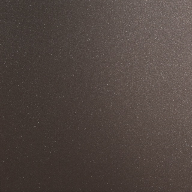
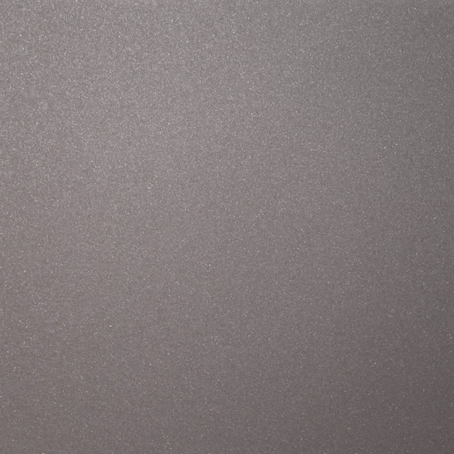
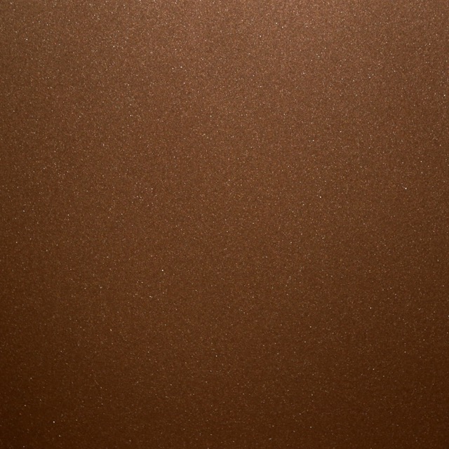
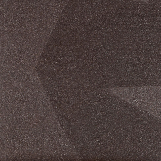
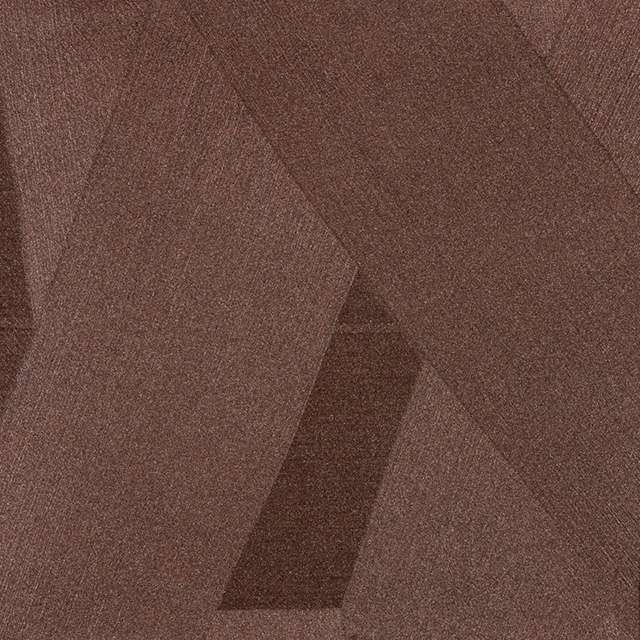
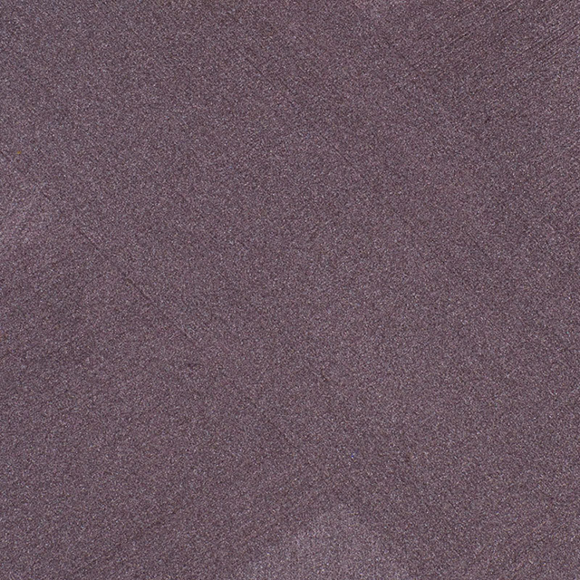
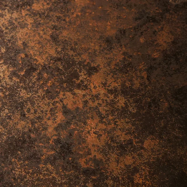
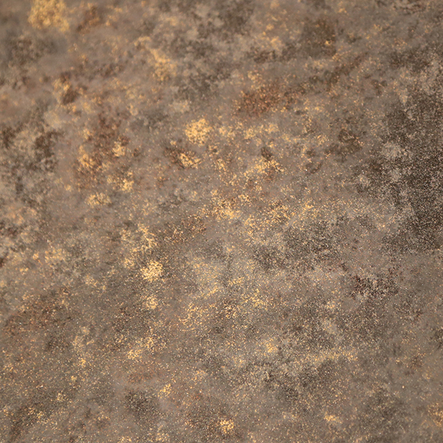
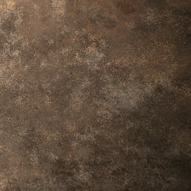
MICACEOUS
Fine particles of pigmented iron oxides fuse to create soft lustrous effects that are reminiscent of a juxtaposed ‘organic-industrial’ finish.
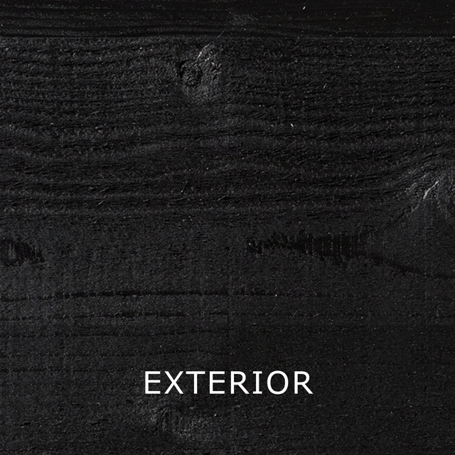
Axolotl Micaceous can be spray or brush applied in two coats to create even or directional effects. With low VOC’s, the water based collection is easy to use and suitable both internally and externally.
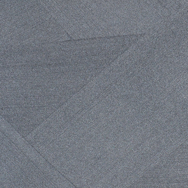


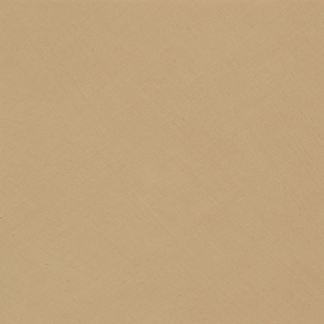
CEMENT PAINT
Axolotl Cement Paint achieves a matte textured effect designed to look weathered and fade with exposure. Axolotl Cement Paint is zero VOC and is sold as a powder to be mixed with water at time of application. Cement Paint can be brush or trowel applied, and can be mixed with the addition of Axolotl Grain to achieve the desired textured effect. Cement Paint is available in a curated range of colours and is suitable for internal and external use.
Axolotl Cement Paint is mixed to order and takes 4-5 business days from receipt of payment. We recommend ordering the full required quantity in one order to ensure colour consistency across your project.


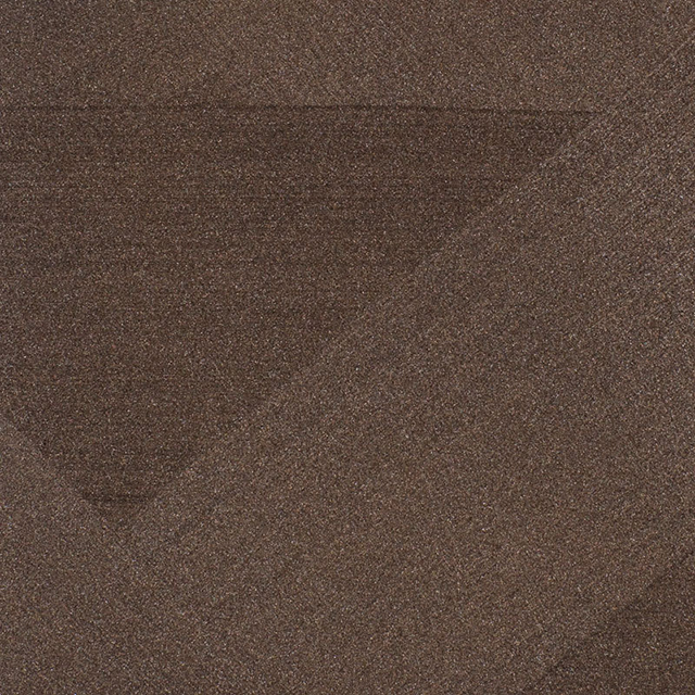
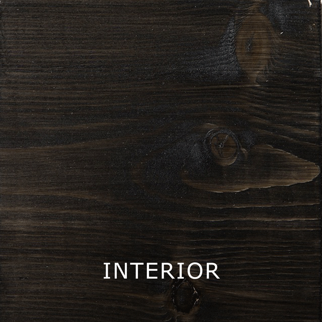
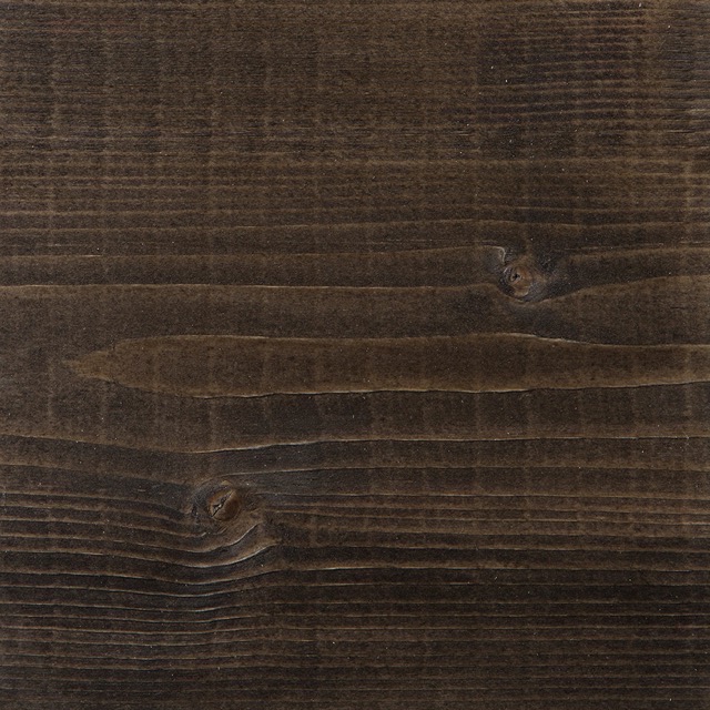
TIMBER WASH
Axolotl Timber Wash capitalises on the natural grain of timber and is the perfect choice in applications where the timber needs both protection and enhanced colour.
With low VOC’s, the water based collection is easy to use and designed for use on quality timbers such as Cedar, Cypress, Oregon, treated Pine, all texture Ply and hardwoods.
Available in both internal and external grade, with the option of sealing with a topcoat for internal use enabling you to create this look on high traffic areas such as furniture, bench tops and floors.
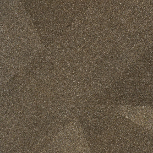
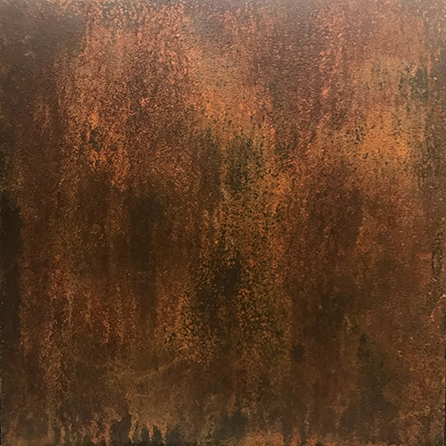
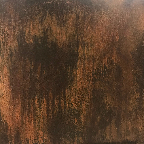
RUST PAINT
An architects favourite because of its character and complexity, Axolotl Rust Paint is an easy to apply and cost effective way to get an authentic rusted effect. As global pioneers in developing a rust finish that could be applied for decorative effect, we have adapted our unique process to give the beauty and patina of rust. The paint works authentically changing in appearance in response to where it’s painted, but without being destructive to the structural integrity of the substrate. The paint can be applied on site for most interior and exterior settings.
CHROMA & METTA
Axolotl Chroma is a high quality acrylic paint designed for internal and external applications. The premium quality base has been formulated to achieve stronger opacity, fuller colours and better paintability than conventional paints. Chroma is available in a variety of bases including: ceiling flat, flat, low sheen, satin & gloss.
Axolotl Metta is a unique flat textured paint with a streak free appearance and subtle colour variation that is easy to apply. The depth and flatness of colour achieved will help to conceal variations in the painted surface and makes Metta paint ideal for facades. Metta is a durable flat base and can be over coated with our clear acrylic sealer for added serviceability. Extra texture can be achieved with the addition of Axolotl Grain, a fine grade sand designed to be mixed in to the Metta base at time of painting.
Both Chroma and Metta are low VOC’s and water based making them easy and eco-friendly to use in any environment. They are suitable for internal and external applications.
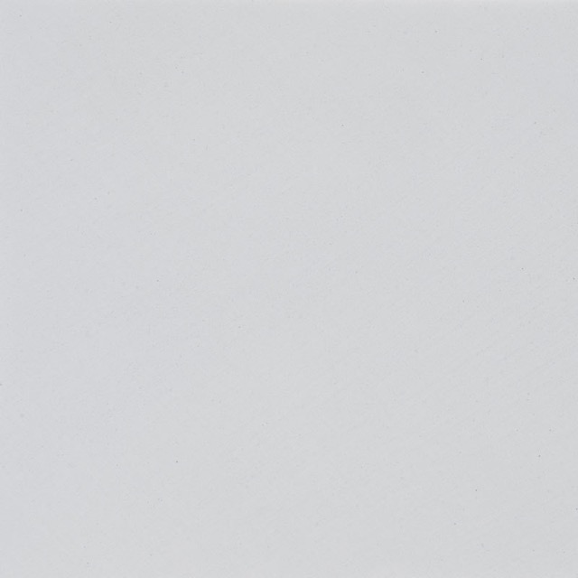


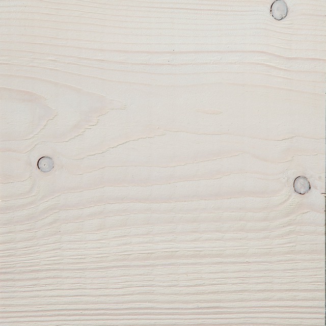
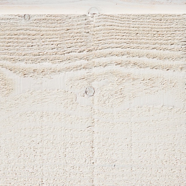
WHITES PALETTE
White will always be a timeless choice for traditional and contemporary styles. It’s undisputed that it can make small spaces appear larger, and and can be the ideal backdrop to showcase art, and designer furnishings.
When it comes to choosing white, it’s really important to take into account a number of factors to get the right tone to complement all elements of the space. A great neutral white should be balanced and not have any strong hues that jump out or contrasts with the surrounding tones. It should also be tested in the space as even the most perfect neutral white can go creamy in natural light or light grey in artificial light.
Yet, white has so much to offer. A ceiling can be made to appear higher by using a white that is sympathetic with the wall colour so you are less aware of where the wall ends, and the ceiling begins. And the right white can work with just about every other colour in the space.
Our whites have different undertones, to help make an inexact science a lot easier it is common to find that a creamy white becomes a true, bright white under artificial light, and a cool white can become warmer under natural light. It also helps to pair the undertone with surrounding colours, for example a cooler undertone will work best when paired with colours in the cool palette such as blues or greys.
In addition, by triple layering the coats, as we recommend you can achieve a depth and strength second to none.


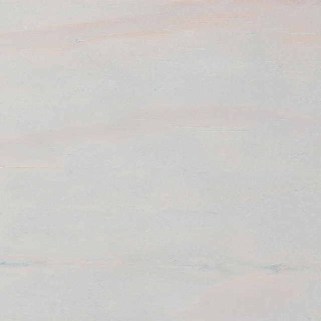
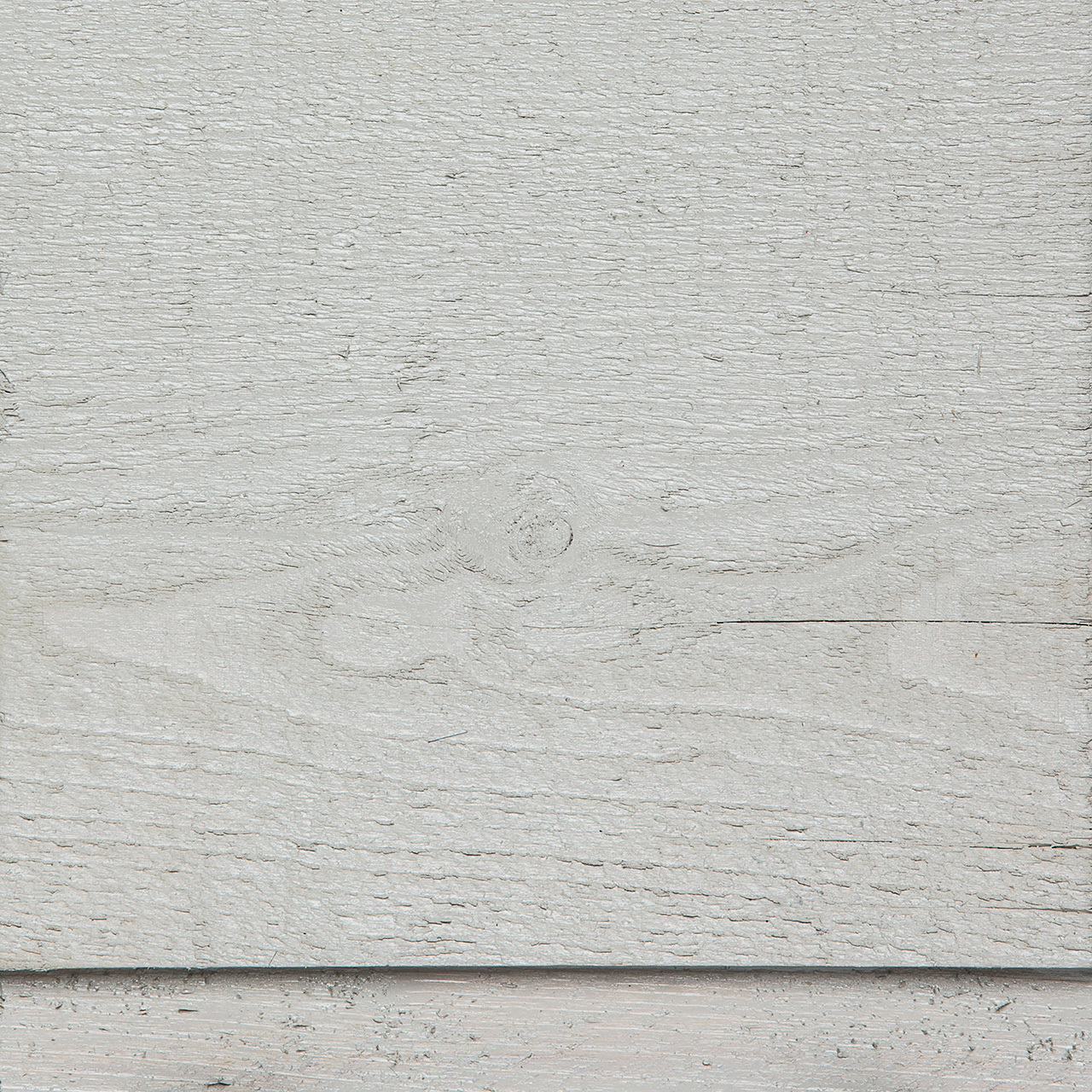
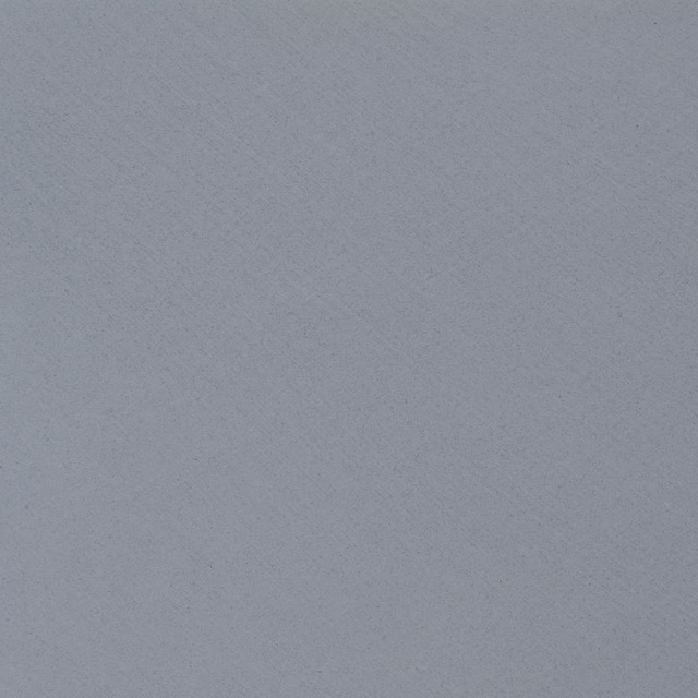
NEUTRALS
Neutrals are arguably not colour at all, yet they have just as much to contribute to creating an impact and bringing to life your vision for how your space will look, feel and work.
What constitutes a neutral can be subjective, but we have selected our palette around those that ground or balance the space, particularly in terms of other colours in the space, like fabrics, art and so on.
In this range you will find tones suited to both cool and warm palettes. We think our neutrals look particularly striking next to natural materials such as stone and timbers.


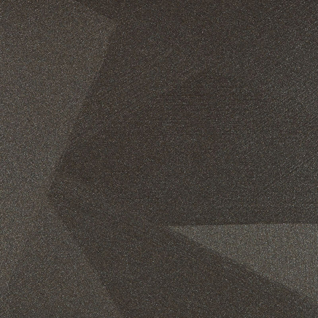
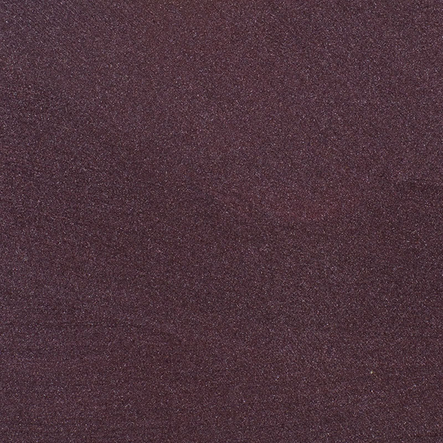
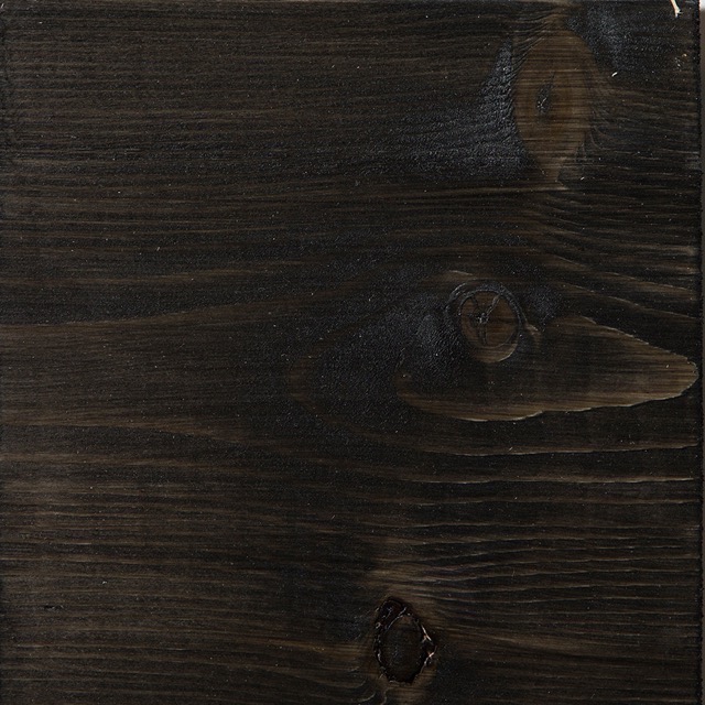
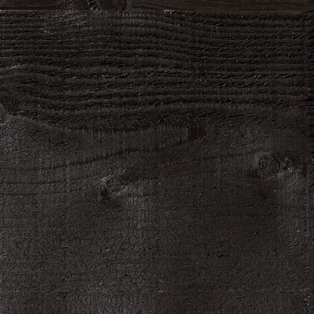
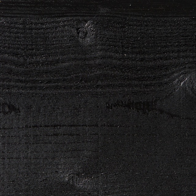
DARKS PALETTE
The colour trend that has been surprisingly persistent over the past few years must be the use of black internally, as well as externally.
Simplistically, dark colours make spaces come towards you, so are felt to make rooms smaller, but when space and light allow the use of dark colours can have spatial and dramatic impact. It’s a brave choice, but also one that can elevate your project to look truly designer and sophisticated.
In some ways, just as much as white, blacks are the perfect neutral as there isn’t a colour they don’t work with. They sit well with other popular materials like timber, marble, concrete and brick.
Just as not all whites are equal, the same can be said of blacks, with the potential to create an array of looks through base colour. We have strived to create a dark palette that moves this trend on to deliver your own unique spin on mood and personality.